Creating Accessible Websites
All website content should be made accessible. Keep in mind that not all individuals will use a mouse and a keyboard to click their way through the web page. All websites need to be compatible with the WCAG 2.0 AA guidelines.
Make Page Titles and Addresses Descriptive
Page titles should appear at the top of every page. Make sure that each page is descriptive enough to know what content exists on the page. Avoid using abbreviations and acronyms within the page title. For example, a page about the Technology Services Department should not be just "Technology" because it could mean any area of technology. A page title of "Technology Department" is more descriptive.
Website addresses should be similar to the page title They should be descriptive enough to describe the page on their own. Multiple words should be separated by hyphens. Short abbreviations should not be used. Here is an example of a page about Technology Services Departments.
- Bad: /tech
- OK But Not Good Enough: /technology
- Best: /technology-department
Keep in mind that screen readers reading the address or page title need full words to pronounce.
Follow Headings Logically
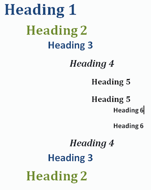
Headings are extremely important to structure and especially to screen readers. All web pages should have a structure that has just one H1 header on the page. All other headings need to be H2 through H6 and should follow the logical order. The headers should not go from H2 to H4, skipping the H3 header. See the example below.

Hyperlinks and Content
When creating hyperlinks on a web page, make sure it is descriptive and unique to what is it linking to. Avoid the use of the term "Click Here" as it is redundant, not unique and if used multiple times on the page, it is certainly not meaningful. The hyperlink needs to reference and describe what you are linking to. For instance, if you have a link to take you to a page on mathematical equations, then the display text should say "Mathematical Equations" and the title should be "Mathematical Equations Website Link".
Avoid having hyperlinks that open in new windows. New windows make it hard to navigate at times when using assistive technology. When it opens in a new window or tab the back button cannot be used for navigation. If a hyperlink must open in a new window, add text within the hyperlink text to say (opens new window). The hyperlink text should be "Mathematical Equations (opens new window)".
Make sure that all content on the page is spelled properly. Make a habit of using a spell checker every time content is edited. It is hard for a screen reader to read misspelled words.
Avoid the use of abbreviations. Always spell out the whole words and then give the abbreviation. For instance, instead of "MDE", use "Michigan Department of Education (MDE)".
Add Alternative Text
Every image should include Alternative Text (sometimes called Alt Text). This is a property of the picture that has a text description associated with the image so when a reader encounters the image it can read what the graphic is about. The description also appears if someone moves a mouse over the image.
When adding alternative text, be descriptive of the meaning of the image. If there is a picture of a black cat playing with a toy, do not just use "cat" and do not use "black cat playing with a toy that has a feather on a string and he is jumping for it". Keep it precise and to the point. A good description would be "black cat playing with a toy".
Tables are for Data and Not Layouts
Tables can be confusing for screen readers. Only use tables for data elements. Many times a table will be used to do a layout of side by side elements such as a picture and a paragraph of text next to the picture. This should never be done.
If tables are used, they should contain table headers. There should be no merged cells. Every column and row should stand on their own and all data should align underneath the column.
Check Color Ratios
Color contrast is very important for visually impaired people. A minimal contrast ratio for all website content is 4.5:1 (four and a half to one).
Determine the colors that are used on the web page and test for Color Contrast.
Color Picker Software
Color Contrast Testing Software and Websites
Post Only Accessible Documents
All posted documents on a website should be accessible and pass all accessibility rules just like a web page.
Use document formats that are compatible with anyone. Try to avoid the use of alternative plugins for displaying documents. For the most part, Word, Excel, PowerPoint, and PDF documents are the common standard with PDF's being the desired format. However, since these formats require additional software, a link to the software should be provided on the page as well.
See Creating Accessible Documents section for more information.
Post Accessible Media
It is important when posting any kind of media on the website that anyone can understand what is being portrayed in the media. Do not assume that anyone can watch and/or listen to the media on the website.
Any video that is posted on the website will need to be closed captioned and a transcript should be provided of the video.
For any audio file that is posted, a transcript of the audio should be provided.
See the Creating Accessible Media section for more information.
